DataEQ — the team behind Good Outcomes — turns unstructured customer data into structured intelligence. They collect what customers are saying publicly — on social media, review platforms, and messaging channels — and process it through a combination of machine learning, generative AI, and human labelling. The result is reliable, labelled data that teams can actually act on. They’ve been doing this since 2007, with deep expertise in financial services.
Good Outcomes takes that foundation further. We apply a conduct intelligence lens to the same data — interpreting it not just for how customers feel, but for what it tells us about whether outcomes are actually being delivered, and where they’re breaking down.
Each year DataEQ publishes industry-level sentiment indices that map how brands are performing through the lens of their customers. The UK Travel Insurance Sentiment Index 2026 captured 206,231 mentions across X and Trustpilot over twelve months, covering four brands: Staysure, InsureandGo, AllClear, and Multitrip. Travel insurance sits at a particular intersection — a product bought on trust and tested only at moments of disruption. Here’s what we found when we read it through a conduct lens.
On the surface, a healthy market
The headline numbers look reassuring. InsureandGo leads the market at 90% net sentiment. Staysure follows at 79%, Multitrip at 77%, AllClear at 75%. A 15-point spread across four brands — narrow enough to suggest an industry that broadly delivers.
Around 40% of all conversation included a Consumer Duty theme. Map that conversation against the FCA’s four outcomes and a clear distribution emerges.
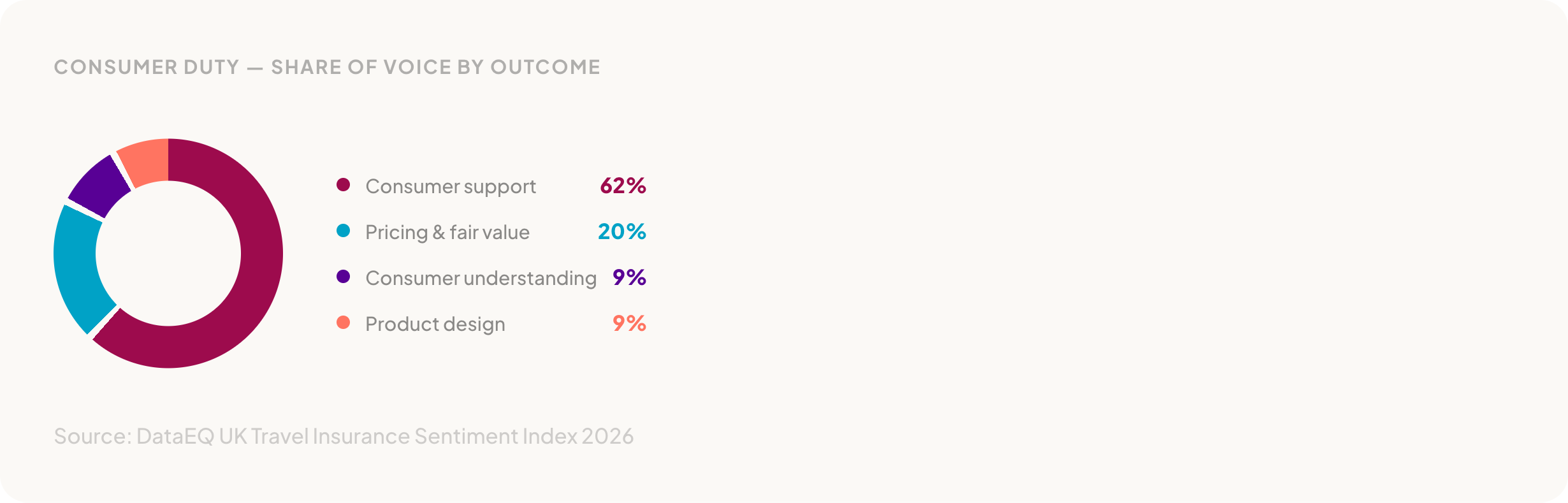
Consumer support dominates at 62% of the Consumer Duty conversation. Pricing and fair value accounts for 20%. Consumer understanding and product design each sit at 9%. AllClear tops operational net sentiment at 92%, driven by praise for helpful and competent staff during support interactions. Customers across brands described smooth purchase journeys and responsive frontline support.
Performance was broadly positive. Staff conduct is the leading driver of positive sentiment at 30%, followed by staff competency at 18% and the application process at 14%. Customers praised knowledgeable agents who took ownership of issues, explained next steps clearly, and followed through without repeated chasing.
But those numbers are built from a particular mix of feedback. Over 200,000 mentions sounds comprehensive. The question is what’s in them — and what they’re actually measuring.
The 86-point evidence gap
The index broke Trustpilot reviews into two categories: invited reviews — those prompted by the insurer after a transaction — and unsolicited feedback — reviews customers left on their own initiative. The gap between them reshapes the entire picture.
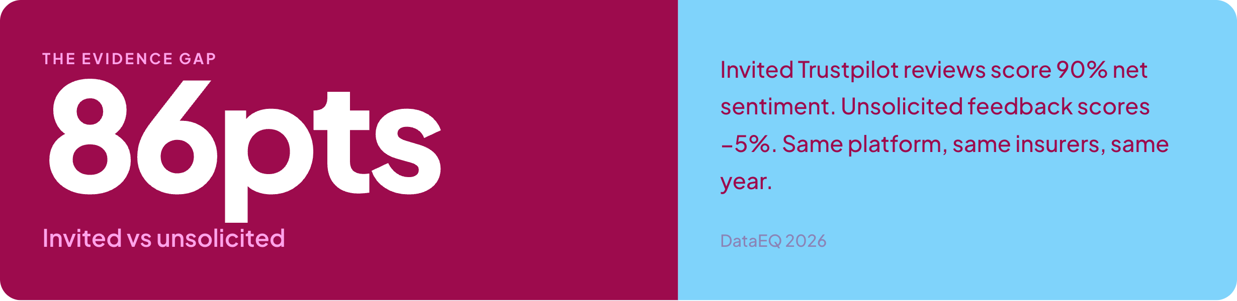
That number needs repeating. Invited reviews, which make up the majority of Trustpilot conversation, score 90% net sentiment. Unsolicited feedback — the reviews customers write because they want to, not because they were asked — scores -5%. Net negative.

The gap holds across every brand. AllClear: 94% invited, -2% unsolicited. InsureandGo: 91% invited, -6% unsolicited. Staysure: 85% invited, -8% unsolicited. Multitrip shows the sharpest contrast: 83% invited, -71% unsolicited.
Invited reviews consistently reflected positive early-stage and transactional experiences — the purchase went smoothly, the website worked, the quote was clear. Unsolicited feedback captured something different: late-stage breakdowns including pricing changes, claims friction, and complaint handling. The experiences customers felt compelled to share without prompting.
For any firm using Trustpilot data to evidence outcomes, the implication is direct. If the data underpinning your view of customer experience is structurally weighted toward invited reviews, the picture will be materially more positive than the experience customers describe on their own.
From purchase to claims: the journey collapses
Map sentiment against the customer journey and the pattern sharpens. In invited reviews, new business scores 93% net sentiment. Mid-term sits at 82%. Renewals at 75%. Claims at 54% — a decline, but still positive.
Strip out the invited reviews and the organic data tells a different story entirely. New business starts positive at 69%. Mid-term drops to 35%. Renewals turn negative at -11%. Claims collapse.

The gradient tells the story. New business earns goodwill — 69% net sentiment from customers who’ve just bought. Mid-term drops to 35%. Renewals turn negative. And claims, at -73%, falls off a cliff. The index found a consistent pattern in claims breakdowns: delays, lack of updates, and difficulty progressing cases. Customers threatened to escalate to the FCA or Ombudsman after internal resolution processes failed.
Renewals at -11% is worth pausing on. These are existing customers — people who already bought the product and are being asked to continue. The index found that renewal negativity centred on price changes and the clarity of those changes. Mid-term premium increases that weren’t clearly explained. Fees that appeared without context. Customers questioned not just the cost, but whether the pricing was fair.
What drives the friction
The index mapped what customers talked about when they complained. Pricing-related complaints — mid-term changes, renewal increases, unexplained fees — together drive a third of all negative conversation.
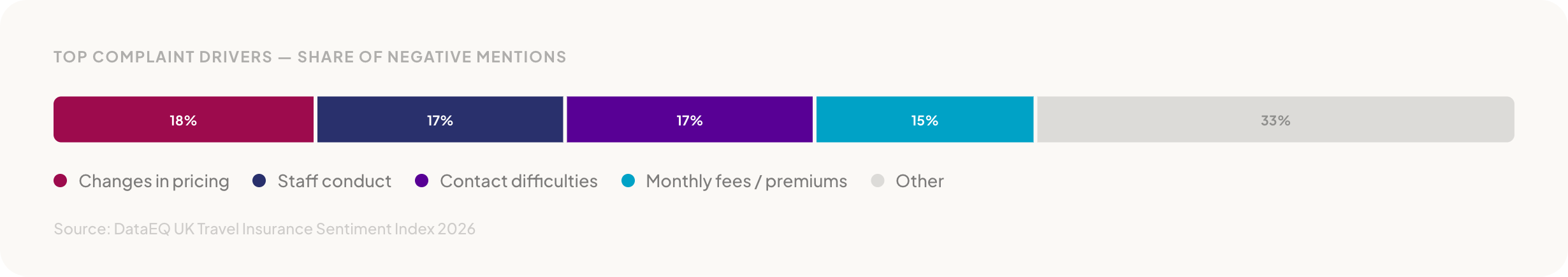
Changes in pricing leads at 18%, closely followed by staff conduct at 17% and contact difficulties at 17%. Monthly fees or premiums account for another 15%. Pricing and fees combined: a third of all complaints.
Staff conduct appearing on both sides of the ledger is the finding worth noting. The same touchpoint — a conversation with an agent — generates the strongest advocacy when it goes well (30% of positive mentions) and significant complaints when it doesn’t (17% of negative mentions). Positive experiences clustered around ownership and empathy. Negative ones emerged when escalations stalled, cases moved between agents, or customers were asked to repeat information.
Contact difficulties compounded the friction. Long call-centre wait times, dropped calls when customers tried to resolve claims or cancellations, slow or unanswered emails forcing customers to chase across channels. Frustration was more about access than capability — customers couldn’t reach the support they needed, regardless of how good that support might be once they got through.
Consumer Duty through the conduct lens
Volume tells you where customers are talking. Sentiment tells you where outcomes are falling short. When you isolate unsolicited feedback — the signal that isn’t invited — a hierarchy of outcome delivery emerges.
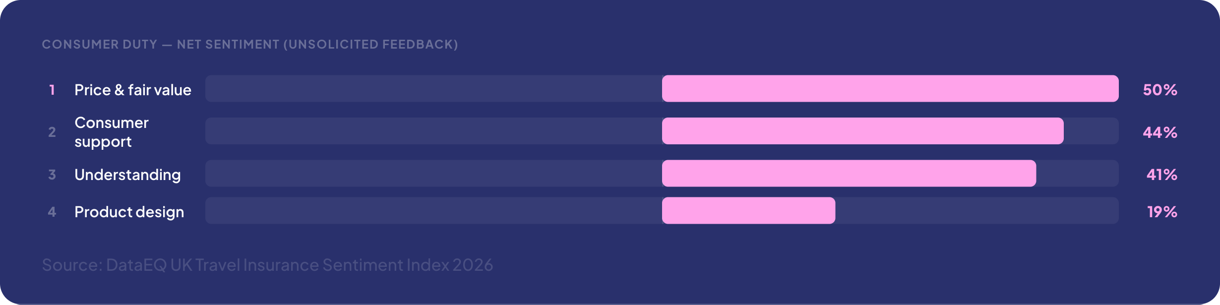
Price and fair value scores highest at 50% — broadly positive, suggesting baseline pricing is perceived as competitive. Consumer support follows at 44%. Consumer understanding at 41%. Product design drops to 19%.
Product design at 19% is a small volume signal, but a sharp one. When product limitations surfaced — when customers tested their cover in practice — dissatisfaction was pronounced. Positive feedback was driven by suitability at purchase. Negative feedback emerged when expectations met reality: cover exclusions, policy limitations, conditions customers didn’t anticipate. The report suggests this is an expectation-setting challenge rather than a product breadth problem.
Consumer understanding at 41% was primarily driven by advice at purchase and contractual disclosure, which generally supported understanding. Breakdowns appeared post-purchase, when customers encountered fees, charges, or conditions they hadn’t expected. Misunderstanding that emerged not from a lack of information, but once expectations were tested against actual costs and conditions.
What the data tells us
Across 206,231 customer mentions, the DataEQ index surfaces a picture that divides cleanly in two.
On one side: a market that handles routine demand effectively. Purchase journeys work. Initial pricing is broadly competitive. Staff support earns genuine advocacy. The headline numbers reflect a product category that, for most customers most of the time, delivers.
On the other: an industry where outcomes deteriorate sharply once journeys become complex. Renewals turn negative. Claims collapse to -73%. The channels customers turn to when they need resolution deliver weaker outcomes than the self-service moments that came before. Pricing changes and fees — which together drive a third of complaints — surface as fair value concerns that the industry’s headline metrics don’t reflect.

None of this is invisible. It’s all there in what customers are already saying — publicly, unprompted, at scale. The question is whether it’s being heard, and whether it’s being interpreted through a lens that connects customer experience to the outcomes regulation expects.
The full DataEQ UK Travel Insurance Sentiment Index 2026 is worth reading. We’ve linked it below.